Scatter Plot
Purpose
Visualize the relationship between two continuous variables to identify patterns, correlations, trends, and outliers.
Analysis Type
Bivariate
What to Look For
1. Linearity
- Non-Linear: Points form a curve (quadratic, exponential, logarithmic), U/S shape waves or saturation/plateau.
- Linear: Points form a roughly straight line pattern (positive or negative) with no obvious bending.
- No relationship: Points scattered randomly
2. Correlation Strength
- Strong: Points tightly clustered around a pattern
- Weak: Points loosely scattered
- None: Random cloud of points
3. Direction
- Positive: As X increases, Y increases
- Negative: As X increases, Y decreases
4. Outliers
- Points far from the main cluster
- May indicate data quality issues or interesting cases
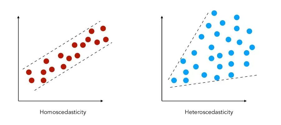
5. Heteroscedasticity
- Variance of Y changes across X values
- Fan-shaped pattern indicates non-constant variance
Code Example
# Basic scatter plot
plt.scatter(df['x_var'], df['y_var'], alpha=0.6)
plt.title("Scatter Plot: X vs Y")
plt.xlabel("X Variable")
plt.ylabel("Y Variable")
plt.show()
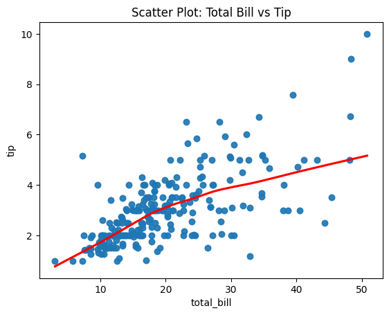
# Seaborn scatter with regression line
sns.regplot(x='x_var', y='y_var', data=df, lowess=True, line_kws={"color": "red"})
plt.title("Scatter Plot with Linear Fit")
plt.show()
Pro Tip - Linearity Detection
Use sns.regplot(x='x_var', y='y_var', data=df, lowess=True, line_kws={"color": "red"}) to fit a LOWESS (locally weighted) curve instead of a straight line. If the red curve is straight, the relationship is linear. If it's curved, the relationship is non-linear and you may need polynomial features or transformations.
Documentation