Residual Plot
Purpose
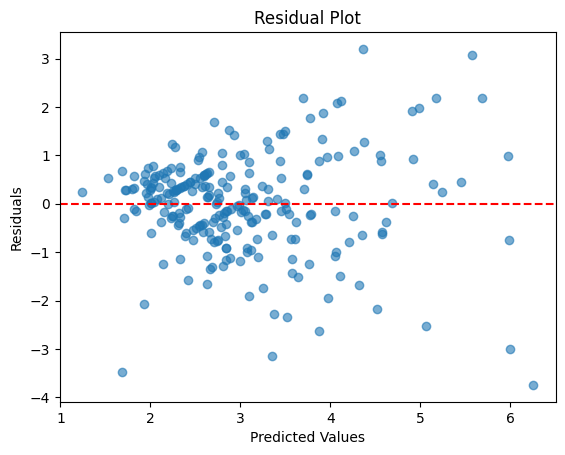
Diagnose regression model assumptions by visualizing the difference between predicted and actual values. Critical for validating linear regression.
Analysis Type
Bivariate (model evaluation)
What to Look For
1. Random Pattern (👍 GOOD)
- Residuals scattered randomly around zero line
- No clear pattern or structure
- Indicates model assumptions are met
2. Linearity
- Linear:
- Residuals look like random noise around zero with no structure (no pattern).
- The spread is fairly constant across predictions (no funnel shape).
- Points are balanced evenly above and below the center line (zero).
- Non-Linear:
- Residuals show a pattern: curve, wave, or systematic drift (e.g., positive then negative).
- “Funnel” shape (variance increases with prediction) often signals missing transformation or non-linear effects.
3. Non-linearity (🚫 BAD)
- U-shape or inverted U-shape: Relationship is non-linear
- Solution: Add polynomial features or transform variables
- Pattern indicates model is missing non-linear terms
4. Heteroscedasticity** (🚫 BAD)
- Fan shape: Variance increases with predicted values
- Funnel shape: Non-constant variance
- Solution: Transform target variable (log, sqrt) or use weighted regression
5. Outliers
- Points far from zero line
- High residual values indicate poor predictions
- May need investigation or removal
6. Systematic Bias
- Most residuals above or below zero
- Indicates systematic over/under-prediction
7. Ideal Pattern
- Residuals centered at zero
- Equal spread across all predicted values
- No patterns, trends, or curves
Code Example
from sklearn.linear_model import LinearRegression

# Fit model
X = df[['feature1', 'feature2']]
y = df['target']
model = LinearRegression()
model.fit(X, y)

# Calculate residuals
y_pred = model.predict(X)
residuals = y - y_pred

# Residual plot
plt.scatter(y_pred, residuals, alpha=0.6)
plt.axhline(y=0, color='red', linestyle='--', linewidth=2)
plt.title("Residual Plot")
plt.xlabel("Predicted Values")
plt.ylabel("Residuals")
plt.show()

# Seaborn version
sns.residplot(x=y_pred, y=y, lowess=True, line_kws={'color': 'red'})
plt.title("Residual Plot with LOWESS")
plt.xlabel("Predicted Values")
plt.ylabel("Residuals")
plt.show()
Pro Tip
Use sns.residplot(..., lowess=True, line_kws={'color': 'red'}) to add a LOWESS smoothing line. If this red line is flat and horizontal at zero, your model is well-specified. If it curves or shows a trend, you have non-linearity issues. Also create a histogram of residuals - they should be normally distributed and centered at zero.
Documentation