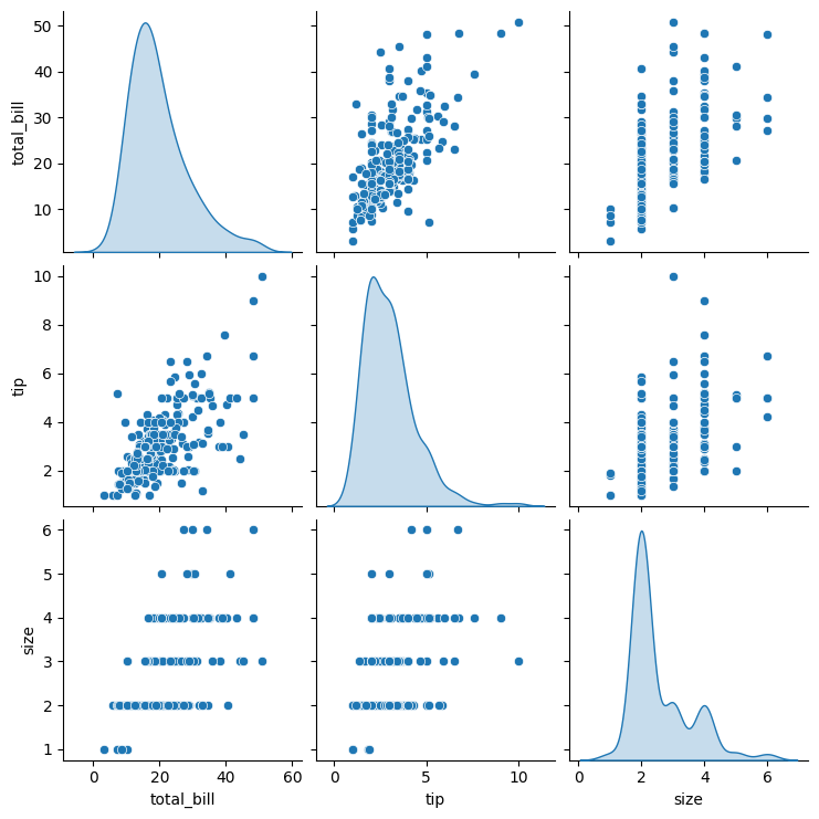
Pair Plot (Scatter Plot Matrix)
Purpose
Visualize pairwise relationships between all numerical variables in a dataset simultaneously. Essential for initial exploratory data analysis. Used for Collinearity and Interaction detection.
Analysis Type
Multivariate
What to Look For
1. Correlation Patterns
- Strong linear patterns: Highly correlated variables (potential multicollinearity)
- Random scatter: Low or no correlation
- Curved patterns: Non-linear relationships
2. Diagonal Plots
- Show univariate distributions (histograms or KDE)
- Check for normality, skewness, and outliers
3. Redundant Features
- Variables with near-perfect linear relationships
- Candidates for removal to reduce dimensionality
4. Feature Selection
- Variables showing strong relationships with target variable
- Variables with no patterns may be less useful
5. Data Quality
- Outliers visible across multiple plots
- Unusual patterns indicating data issues
6. Class Separation
- When using
hueparameter with target variable - Look for variables where classes separate well
7. Linearity
- Linear:
- Most of the mini scatter plots show elongated, straight ellipses rather than curves.
- If you see a consistent straight trend across multiple feature pairs, linear structure is likely.
- Non-Linear:
- You spot curved bands (U, S), "funnel" or "fan" shapes or distinct circular or banana-shaped "clouds" with no direction.
- Clusters appear (separate blobs), suggesting the relationship depends on subgroup or a non-linear boundary.
Code Example
# Basic pair plot
sns.pairplot(df)
plt.show()

# Pair plot with color by target variable
sns.pairplot(df, hue='target_variable', diag_kind='kde')
plt.show()

# Pair plot for specific columns
sns.pairplot(df[['var1', 'var2', 'var3', 'target']], hue='target')
plt.show()
Pro Tip
Use diag_kind='kde' instead of default histograms for smoother distribution visualization: sns.pairplot(df, diag_kind='kde'). When working with large datasets, use plot_kws={'alpha': 0.5, 's': 10} to make points smaller and transparent. Add corner=True to show only the lower triangle and save space: sns.pairplot(df, corner=True).
Documentation