Andrews Curves
Purpose
Visualize multivariate data by representing each observation as a curve, useful for identifying clusters and outliers.
Analysis Type
Multivariate
What to Look For
1. Cluster Separation
- Grouped curves: Similar observations
- Separated curve groups: Distinct classes
- Good for classification problems
2. Outliers
- Curves far from main groups
- Unusual patterns or trajectories
3. Class Distinction
- Different colors for different classes
- Well-separated colors indicate good class separability
- Overlapping colors suggest difficult classification
4. Pattern Recognition
- Similar curve shapes indicate similar multivariate patterns
- Different patterns suggest different data structure
Code Example
# Example: Andrews Curves using seaborn's iris dataset
import seaborn as sns
import matplotlib.pyplot as plt
from pandas.plotting import andrews_curves

# Load sample dataset
iris = sns.load_dataset('iris')

# Andrews curves by species
plt.figure(figsize=(10, 6))
andrews_curves(iris, 'species')
plt.title("Andrews Curves by Species (Iris Dataset)")
plt.legend(loc='best')
plt.grid(True, alpha=0.3)
plt.show()
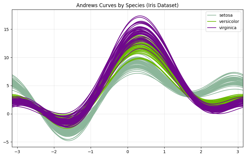
Andrews curves are most effective with scaled/standardized features. Preprocess with StandardScaler before plotting: from sklearn.preprocessing import StandardScaler; scaler = StandardScaler(); df_scaled = pd.DataFrame(scaler.fit_transform(df.drop('class', axis=1)), columns=df.drop('class', axis=1).columns); df_scaled['class'] = df['class'].values; andrews_curves(df_scaled, 'class'). Best for 4-10 features; too many features create cluttered plots.
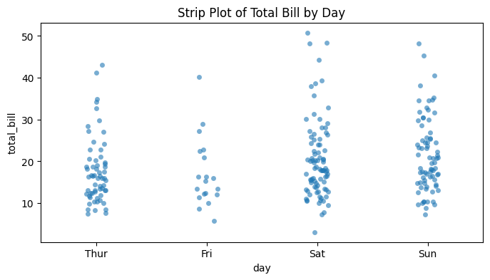
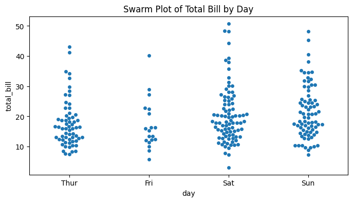
Strip Plot / Swarm Plot
Purpose
Show individual data points for categorical variables, revealing distribution and avoiding overplotting through positioning.
Analysis Type
Bivariate (categorical vs. continuous)
What to Look For
1. Individual Observations
- See every data point
- Identify exact values
- Better than bar plots for small datasets
2. Distribution Shape
- Density of points at different values
- Clusters and gaps
- Similar to violin plot but shows actual data
3. Outliers
- Points far from main cluster
- Easier to count and identify than in box plots
4. Sample Size
- Number of points visible
- Detect small sample sizes
- Check for imbalanced groups
5. Overlap Patterns
- Strip plot: Points may overlap (use jitter)
- Swarm plot: Points arranged to avoid overlap (better for smaller datasets)
Code Example
# Example: Strip Plot and Swarm Plot using seaborn's tips dataset
import seaborn as sns
import matplotlib.pyplot as plt

# Load sample dataset
tips = sns.load_dataset('tips')

# Strip plot with jitter
plt.figure(figsize=(8, 4))
sns.stripplot(x='day', y='total_bill', data=tips, jitter=True, alpha=0.6)
plt.title("Strip Plot of Total Bill by Day")
plt.show()

# Swarm plot (no overlap)
plt.figure(figsize=(8, 4))
sns.swarmplot(x='day', y='total_bill', data=tips)
plt.title("Swarm Plot of Total Bill by Day")
plt.show()

# Combined with box plot
fig, ax = plt.subplots(figsize=(10, 6))
sns.boxplot(x='day', y='total_bill', data=tips, ax=ax)
sns.stripplot(x='day', y='total_bill', data=tips, color='black', alpha=0.3, ax=ax)
plt.title("Box Plot with Strip Plot Overlay (Total Bill by Day)")
plt.show()
!Pasted image 20260313092508.png
Layer strip plots over box/violin plots to show both distribution summary and individual points: sns.violinplot(x='cat', y='val', data=df); sns.stripplot(x='cat', y='val', data=df, color='black', alpha=0.3, size=3). Use swarm plots for datasets with < 500 points (they're slower but clearer), and strip plots with jitter=0.2 for larger datasets. Add dodge=True when using hue parameter to separate overlapping groups.