Distribution Plot (KDE Plot)
Purpose
Show smooth continuous probability density of a variable using kernel density estimation. Alternative to histograms with smoother appearance.
Histogram = discrete distribution view
KDE = smooth distribution view
Analysis Type
Univariate
What to Look For
1. Distribution Shape
- Smooth curve instead of histogram bars
- Easier to see overall shape
- Better for presentations
2. Peaks (Modes)
- One peak: Unimodal
- Two peaks: Bimodal (two subgroups)
- Multiple peaks: Multimodal, which often signals non-linear hidden subgroups.
3. Symmetry
- Symmetric peaks suggest normal distribution
- Asymmetric peaks indicate skewness
4. Tail Behavior
- Long tails indicate extreme values
- Short tails indicate concentrated data
5. Comparing Distributions
- Overlay multiple KDEs to compare groups
- Look for separation between groups
- Useful for understanding class distributions
6. Linearity
- Linear:
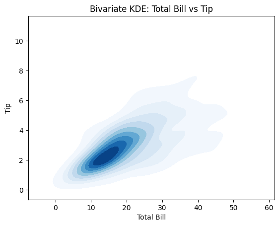
- In 2D KDE (feature vs target), density contours look like tilted ellipses (like a stretched oval).
- In 1D KDE, a single, smooth, unimodal shape often aligns with simpler (often more linear) relationships.
- Non-Linear:
- In 2D KDE, contours bend (banana shape), show multiple lobes, or curve around → strong non-linear structure.
- Multiple peaks (Bimodal/Multimodal) or a very "long tail" stretching far to one side.
7. Gaussian distribution
Histograms with KDE's Interpretation
- Bell-shaped curve = likely normal
- Skewed left/right = not normal
- Multiple peaks = multimodal distribution, not normal
Code Example
# Example: Distribution Plot (KDE Plot) using seaborn's tips dataset
import seaborn as sns
import matplotlib.pyplot as plt
# Load sample dataset
tips = sns.load_dataset('tips')
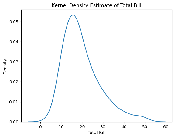
# KDE plot for total_bill
sns.kdeplot(tips['total_bill'])
plt.title("Kernel Density Estimate of Total Bill")
plt.xlabel("Total Bill")
plt.ylabel("Density")
plt.show()
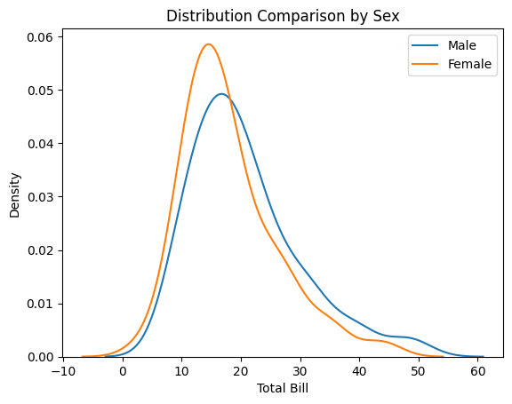
# Multiple KDE plots for comparison (by sex)
sns.kdeplot(tips[tips['sex']=='Male']['total_bill'], label='Male')
sns.kdeplot(tips[tips['sex']=='Female']['total_bill'], label='Female')
plt.title("Distribution Comparison by Sex")
plt.xlabel("Total Bill")
plt.legend()
plt.show()
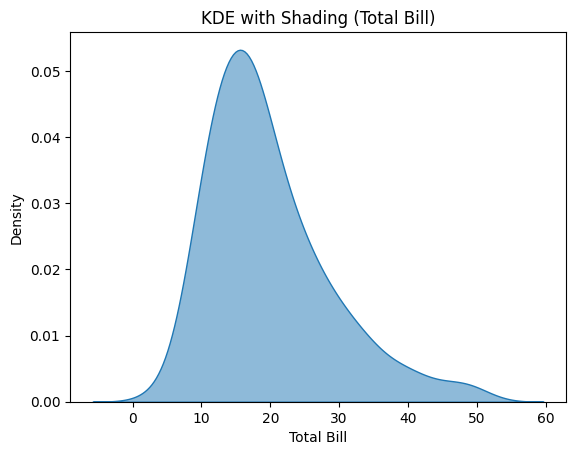
# KDE with shading
sns.kdeplot(tips['total_bill'], fill=True, alpha=0.5)
plt.title("KDE with Shading (Total Bill)")
plt.xlabel("Total Bill")
plt.show()
# Bivariate KDE: total_bill vs tip
sns.kdeplot(x='total_bill', y='tip', data=tips, fill=True, cmap='Blues')
plt.title("Bivariate KDE: Total Bill vs Tip")
plt.xlabel("Total Bill")
plt.ylabel("Tip")
plt.show()
Pro Tip
Use bw_adjust parameter to control smoothness: sns.kdeplot(df['var'], bw_adjust=0.5) for less smooth (more detail), or bw_adjust=2 for smoother curves. Default is 1. For comparing groups, use different colors with transparency: sns.kdeplot(data=df, x='value', hue='group', fill=True, alpha=0.5, common_norm=False) to see overlapping distributions clearly. Set cut=0 to limit KDE to actual data range instead of extending beyond.
Documentation