Joint Plot
Purpose
Combine scatter plot with marginal distributions (histograms or KDE) to show bivariate relationships and univariate distributions simultaneously.
Analysis Type
Bivariate with univariate margins
What to Look For
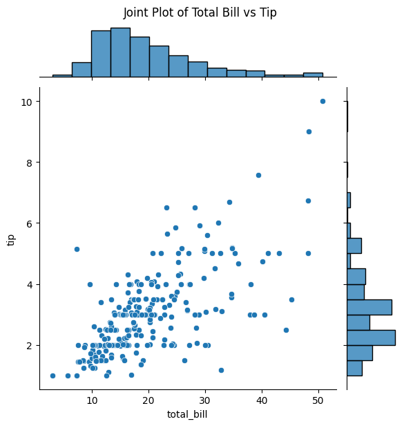
1. Central Scatter Plot
- Same interpretation as regular scatter plot
- Correlation and relationship patterns
- Linearity and outliers
2. Marginal Distributions
- Top histogram/KDE: Distribution of X variable
- Right histogram/KDE: Distribution of Y variable
- Check for normality and skewness
3. Joint Distribution
- How both variables distribute together
- Concentration of points indicates joint probability
- Useful for understanding data structure
4. Different Joint Plot Types
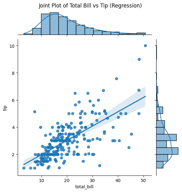
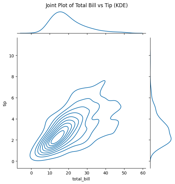
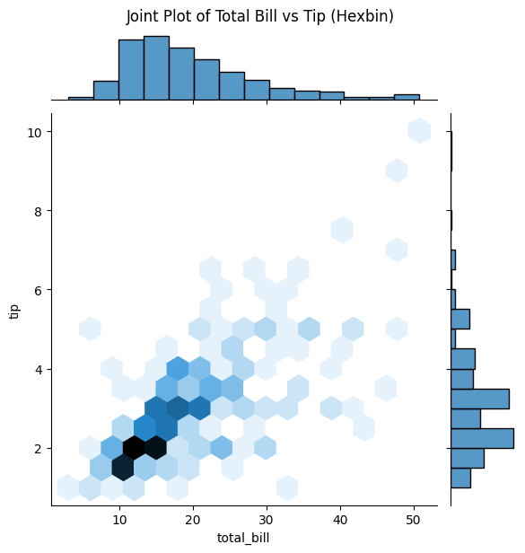
- kind='scatter': Basic scatter with histograms
- kind='hex': Hexagonal binning (good for many points)
- kind='kde': Bivariate kernel density
- kind='reg': Scatter with regression line
- kind='resid': Residual plot
Code Example
# Example: Joint Plot using seaborn's tips dataset
import seaborn as sns
import matplotlib.pyplot as plt

# Load sample dataset
tips = sns.load_dataset('tips')

# Basic joint plot
sns.jointplot(x='total_bill', y='tip', data=tips)
plt.suptitle('Joint Plot of Total Bill vs Tip', y=1.02)
plt.show()

# Joint plot with regression
sns.jointplot(x='total_bill', y='tip', data=tips, kind='reg')
plt.suptitle("Joint Plot of Total Bill vs Tip (Regression)", y=1.02)
plt.show()

# Joint plot with KDE
sns.jointplot(x='total_bill', y='tip', data=tips, kind='kde')
plt.suptitle("Joint Plot of Total Bill vs Tip (KDE)", y=1.02)
plt.show()

# Hexbin for large datasets
sns.jointplot(x='total_bill', y='tip', data=tips, kind='hex')
plt.suptitle("Joint Plot of Total Bill vs Tip (Hexbin)", y=1.02)
plt.show()
Documentation