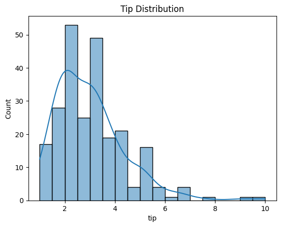
Histogram Plot
Purpose
Visualize the frequency distribution of a single continuous variable to understand its shape, central tendency, and spread.
Histogram = discrete distribution view
KDE = smooth distribution view
Analysis Type
Univariate
Documentation
What to Look For
1. Distribution Shape
- Symmetric: Data evenly distributed around the center (potential normal distribution)
- Skewed Right (Positive Skew): Long tail on the right side
- Skewed Left (Negative Skew): Long tail on the left side
- Bimodal/Multimodal: Multiple peaks indicating subgroups
2. Normality Check
- Bell-shaped curve suggests normal distribution
- Important for many ML algorithms that assume normality
3. Outliers
- Values far from the main distribution
- Appear as isolated bars at extremes
4. Range and Spread
- Width of distribution indicates variability
- Narrow distribution = low variance
- Wide distribution = high variance
5. Linearity
- Linear:
- Roughly symmetric or bell-shaped curve" (Normal) shape often pairs well with linear models (after standardization).
- If both feature and target look fairly “well-behaved” (not extreme skew), linear relationships are easier to spot.
- Non-Linear:
- A "Heavy Tail" or "Skewed" histogram usually indicates exponential or multiplicative behavior,thus the feature will have a non-linear relationship with other variables. They often suggest transformations that linearize relationships.
- Multimodal histograms (two peaks) can signal hidden groups, which often creates non-linear patterns in scatter plots.
Code Example
# Basic histogram
plt.hist(df['column'], bins=30, edgecolor='black', alpha=0.7)
plt.title("Distribution of Variable")
plt.xlabel("Value")
plt.ylabel("Frequency")
plt.show()

# Seaborn with KDE overlay
sns.histplot(df['column'], kde=True, bins=30)
plt.title("Distribution with KDE")
plt.show()
Pro Tip
Use kde=True in sns.histplot() to overlay a kernel density estimate curve, which smooths the distribution and makes patterns easier to see. If the KDE curve is bell-shaped and symmetric, your data is likely normally distributed.