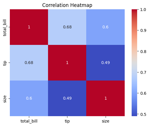
Heatmap (Correlation Matrix)
I. Purpose
A heatmap shows correlations (correlation coefficients) between numerical variables using a color-coded matrix. Essential for identifying multicollinearity and feature relationships. Correlation measures linear relationship only.
⚠️ A non-linear relationship
may show zero correlation even though relationship exists.
II. Analysis Type
Multivariate
III. What to Look For
1. Correlation Strength
- Close to +1: Strong positive correlation (darker red/hot color)
- Close to -1: Strong negative correlation (darker blue/cold color)
- Close to 0: No linear correlation (neutral color)
2. Multicollinearity
- High correlations (|r| > 0.8) between predictors
- Problem for linear models (regression, logistic regression)
- Consider removing one of the correlated variables
3. Target Variable Relationships
- Variables with high correlation to target are important features
- Variables with near-zero correlation may be less useful
4. Redundant Features
- Variables with correlations close to 1.0 or -1.0
- Keep only one from highly correlated pairs
5. Feature Groups
- Clusters of correlated variables
- May indicate related features or domains
6. Linearity
- Linear:
- Strong correlations (near +1 or -1) are a good hint of linear relationships between numeric variables.
- Non-Linear:
- Correlation near 0 does not mean “no relationship”—it often means “possibly non-linear.”
IV. Common Patterns and Their Meanings
| Pattern | Visual Cue | Interpretation | Action |
|---|---|---|---|
| Strong positive corr | Dark red/hot color, value near +1 | Linear relationship, features move together | Use for feature selection, beware multicollinearity |
| Strong negative corr | Dark blue/cold color, value near -1 | Linear relationship, features move oppositely | Use for feature selection, beware multicollinearity |
| No correlation | Neutral color, value near 0 | No linear relationship | May be non-linear, check scatter plot |
| Multicollinearity | Multiple strong correlations among predictors | Predictors highly related | Remove or combine correlated features |
| Feature clusters | Blocks of similar color | Groups of related features | Consider dimensionality reduction |
| Redundant features | Value near 1.0 or -1.0 | Features nearly identical or inverse | Keep only one from pair |
| Target relationships | Strong color in target row/col | Feature important for prediction | Use for feature selection |
V. Advantages of Heatmaps
- Visualize complex relationships between many variables at once
- Quickly spot strong correlations, multicollinearity, and feature groups
- Color coding makes patterns and clusters easy to interpret
- Can be used for any matrix (not just correlation)
VII. Disadvantages
- Only shows linear relationships (misses non-linear patterns)
- Can be misleading if data is not standardized or normalized
- Color scale can exaggerate or hide small differences
- Large matrices can be hard to read without masking or clustering
- Does not show causality, only association
- May hide underlying distribution or outliers
VIII. Code Example
# Basic correlation heatmap
corr_matrix = df.corr()
sns.heatmap(corr_matrix, annot=True, cmap='coolwarm', center=0)
plt.title("Correlation Heatmap")
plt.show()

# With better formatting
plt.figure(figsize=(10, 8))
sns.heatmap(df.corr(), annot=True, fmt='.2f', cmap='coolwarm',
            square=True, linewidths=0.5, center=0,
            cbar_kws={"shrink": 0.8})
plt.title("Feature Correlation Matrix")
plt.tight_layout()
plt.show()
VI. Best Practices for Effective Heatmaps
- Diverging colormap like 'coolwarm' or 'RdBu_r' with
center=0helps to clearly distinguish positive (warm colors) from negative (cool colors) correlations.
sns.heatmap(df.corr(), cmap='coolwarm', center=0)
- Mask upper triangle for symmetric matrices to avoid redundancy
import numpy as np
corr = df.corr()
mask = np.triu(np.ones_like(corr, dtype=bool))
sns.heatmap(corr, mask=mask, cmap='coolwarm', center=0)
- Annotate values for interpretability (annot=True, fmt='.2f')
sns.heatmap(df.corr(), annot=True, fmt='.2f')
- Use square=True for correlation matrices
sns.heatmap(df.corr(), square=True)