Bubble Plot (Bubble Chart)
I. Purpose
Visualize relationships among three or four continuous variables simultaneously. A bubble plot extends the scatter plot by encoding a third variable through bubble size, and optionally a fourth variable through bubble color (hue). This is particularly useful for:
- Exploring multidimensional relationships in data
- Identifying clusters or patterns across multiple dimensions
- Comparing magnitudes across categories while examining correlations
- Presenting business metrics (e.g., market analysis: sales vs profit vs market share)
II. Analysis Type
Multivariate (Three or four numeric features, optionally with categories)
III. What to Look For
1. Three-Way Relationships
- X-Y correlation: Does the scatter pattern show a relationship?
- Size influence: Do larger bubbles cluster in certain regions?
- Combined patterns: Does bubble size strengthen or weaken the X-Y relationship?
2. Clusters and Groupings
- Spatial clusters: Groups of bubbles in specific X-Y regions
- Size-based clusters: Areas dominated by large or small bubbles
- Category patterns: When using color/hue, do categories occupy distinct regions?
3. Outliers
- Positional outliers: Bubbles far from the main cluster
- Size outliers: Unusually large or small bubbles
- Multi-dimensional outliers: Extreme in multiple dimensions
4. Distribution Patterns
- Bubble density: Where are most bubbles concentrated?
- Size distribution: Are bubbles mostly similar or highly variable in size?
- Overlap: Heavy overlap may indicate overplotting issues
5. Proportionality
- Size accuracy: Bubble area should be proportional to the value
- Scale interpretation: Use legends to understand size ranges
- Visual balance: Extremely large bubbles may obscure smaller ones
IV. Advantages of Bubble Plots
-
Higher Dimensionality: It allows you to visualize relationships between four variables at once (X, Y, Size, Color), making it easier to spot complex interactions that a simple 2D plot would miss.
-
Identification of Non-Linear Clusters: Like a scatter plot, it is excellent for spotting non-linear trends; however, the "size" dimension can reveal if the intensity or volume of a feature changes as you move across the axes.
| Relationship | How to Spot it in a Bubble Plot |
|---|---|
| Linear | The bubbles form a straight diagonal "string." Crucially, the size of the bubbles should also stay consistent or grow/shrink at a steady rate along that line. |
| Non-Linear | The bubbles follow a curved path. You might also see a "Growth Pattern" where bubbles start small in one corner and become massive in another, indicating an exponential relationship. |
-
Outlier Detection in Context: You can quickly see if an outlier is just a single point or part of a larger, high-volume cluster based on the bubble size.
-
Comparison of Groups: By using color for categories, you can see if different classes follow different linear or non-linear paths while also seeing their relative weight (size).
V. Drawbacks of Bubble Plots
-
Scale Distortion: If the "size" variable has extreme outliers, most of your bubbles will look like tiny dots while one or two bubbles take up the entire screen.
-
Computational Weight: Rendering thousands of bubbles with individual sizes and colors is more computationally expensive than a standard scatter plot.
VI. When to Use Bubble Plots
- You have 3-4 continuous variables to compare
- Sample size is moderate (50-500 points) - too few lacks patterns, too many causes overplotting
- The size variable adds meaningful information beyond X and Y
- You want to communicate complex relationships to stakeholders
VII. When to Avoid Bubble Plots
-
High Data Density (Over-plotting): If you have thousands of data points, do not use a bubble plot. The bubbles will overlap (occlusion), hiding smaller data points and creating a "blob" that is impossible to interpret.
-
Negative or Zero Values for Size: You cannot visually represent a negative or zero value with a "size." If your third variable includes negative numbers (like "Profit/Loss"), a bubble plot will fail to render that data correctly.
-
Narrow Range in the 'Size' Variable: If the values for your third variable are all very similar (e.g., between 10.1 and 10.5), the bubbles will all look the same size, making the visual complexity of the plot pointless. The human eye is notoriously bad at accurately comparing the areas of circles. Users may struggle to distinguish if a bubble representing a value of 10.1 is truly twice as large as one representing 10.5.
VIII. Code Example
import matplotlib.pyplot as plt
import seaborn as sns
import numpy as np
# Load a dataset with multiple numeric features
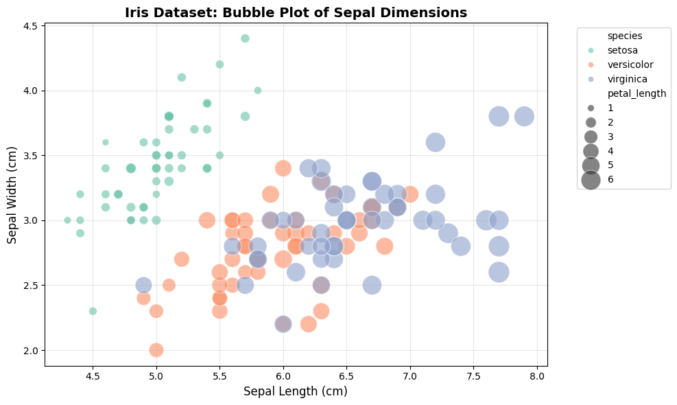
df = sns.load_dataset('iris')
# Create bubble plot: Sepal Length vs Sepal Width, size = Petal Length, color = Species
plt.figure(figsize=(10, 6))
sns.scatterplot(
data=df,
x='sepal_length',
y='sepal_width',
size='petal_length', # Third dimension: bubble size
hue='species', # Fourth dimension: color
sizes=(50, 500), # Control size range
alpha=0.6, # Transparency for overlap visibility
palette='Set2'
)
plt.title("Iris Dataset: Bubble Plot of Sepal Dimensions", fontsize=14, fontweight='bold')
plt.xlabel("Sepal Length (cm)", fontsize=12)
plt.ylabel("Sepal Width (cm)", fontsize=12)
plt.legend(bbox_to_anchor=(1.05, 1), loc='upper left', fontsize=10)
plt.grid(alpha=0.3)
plt.tight_layout()
plt.show()
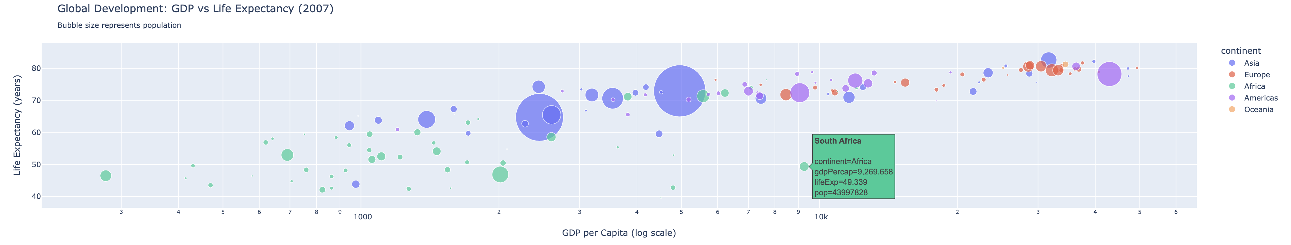
Interactive Bubble Plot with Plotly
import plotly.express as px

# Load sample data
df = px.data.gapminder().query("year == 2007")

# Create interactive bubble plot
fig = px.scatter(
    df,
    x='gdpPercap',
    y='lifeExp',
    size='pop',              # Bubble size: population
    color='continent',       # Color by continent
    hover_name='country',    # Show country on hover
    log_x=True,              # Log scale for GDP
    size_max=60,             # Maximum bubble size
    title='Global Development: GDP vs Life Expectancy (2007)<br><sub>Bubble size represents population</sub>'
)

fig.update_layout(
    xaxis_title='GDP per Capita (log scale)',
    yaxis_title='Life Expectancy (years)',
    font=dict(size=12),
    hovermode='closest'
)

fig.show()
IX. Interpretation Guide
1. Reading Bubble Size
- Bubble area is proportional to the value (not diameter)
- Use the legend to understand the size scale
- Compare bubbles visually: a bubble twice the area represents twice the value
2. Common Patterns and Their Meanings
| Pattern | Visual Cue | Interpretation | Action |
|---|---|---|---|
| Linear relationship | Bubbles form a straight diagonal string | Linear correlation between X and Y | Consider linear regression |
| Non-linear relationship | Bubbles follow a curve or cluster in arcs | Non-linear or polynomial relationship | Consider polynomial or non-linear model |
| Clustered bubbles | Groups of bubbles in specific regions | Subgroups or latent classes | Investigate group characteristics |
| Large size outliers | One or few bubbles much larger than others | Extreme values in size variable | Check for outliers or data errors |
| Overplotting/occlusion | Many bubbles overlap, forming dense regions | Too many points, hard to interpret | Use transparency, facet, or filter data |
| Category separation (hue) | Colors cluster in different plot regions | Category effect on X/Y/size | Explore category-specific trends |
3. Visual Cues for Proportionality
- Bubble area (not diameter) should represent the value
- Use clear legends for size and color
- Avoid using negative or zero values for size
4. Spotting Linear vs. Non-Linear Trends
- Linear: Bubbles align along a straight path, size changes steadily
- Non-linear: Bubbles curve, cluster, or change size non-uniformly
5. Outlier and Cluster Detection
- Outliers: Bubbles far from main cluster or much larger/smaller than others
- Clusters: Groups of bubbles in specific X-Y regions, often with similar size/color
X. Pro Tips for Bubble Plots
1. Size Overplotting (Occlusion)
- Too many large bubbles can obscure smaller data points, effectively "hiding" the distribution.
- Solutions:
- Use
alpha=0.5to0.7for transparency - Add
edgecolors='black'andlinewidth=0.5for clear boundaries - Use faceted plots to split data by category
- Use
2. Scaling Issues (Invisible or Exploding Bubbles)
- If your size variable is too small, bubbles may be invisible; if it contains extreme outliers, one bubble can take over the entire plot.
- Solutions:
- Use
sizes=(min, max)in Seaborn to normalize bubble range - Multiply size variable by a constant in Matplotlib (e.g.,
s=data * 20) - Use log scales for highly skewed data
- Use
3. Human Perception Errors
- The human eye is bad at comparing area differences between circles.
- Solutions:
- Ensure the parameter represents area (not radius)
- Always include a size legend
4. Cognitive Overload (Too Many Variables)
- Combining X, Y, Size, and Color can be overwhelming for a static image.
- Solutions:
- Limit to 3–4 categories when using color encoding
- Use interactive libraries (e.g., Plotly) for hover information
XI. Documentation & External References
Official Documentation: