Box Plot (Box-and-Whisker Plot)
I. Purpose
Display the distribution and identify outliers in data through quartiles. Excellent for comparing distributions across categories.
II. Analysis Type
Univariate (single variable) or Bivariate (variable across categories)
III. Understanding Box Plot Components
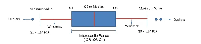
1. Central Tendency
- Median (Line inside box) Medium is approximately in center of Q1 and Q3. (50th percentile)
- Position indicates where data is centered
2. Spread (IQR)
- Interquartile Range (Box height): (
) - Contains middle 50% of data
- Larger box = more variability
3. Outliers
- Lower fence =
(outliers below this) - Upper fence =
(outliers above this) - Individual points beyond whiskers are outliers.
- Mathematically defined as values
or
4. Skewness
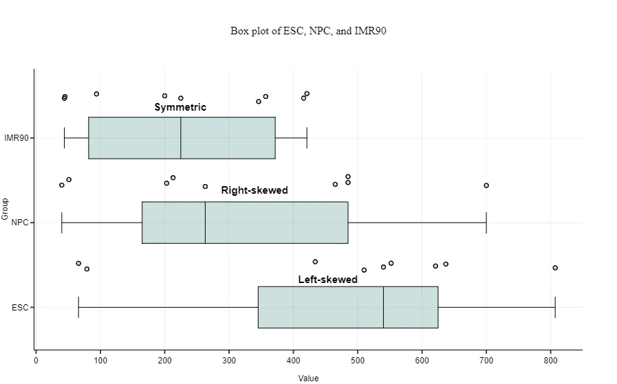
- Right-skewed: Right side of the box-and-whisker plot is longer ➛ Median closer to Q1
- Left-skewed: Left side of the box-and-whisker plot is longer ➛ Median closer to Q3 Left-skewed
- Symmetric distribution: Medium is approximately in center of Q1 and Q3.
5. The whiskers:
- The lines coming out from each box extend from the maximum to the minimum values of each set.
- Together with the box, the whiskers show how big a range there is between those two extremes.
- Larger ranges indicate wider distribution, that is, more scattered data.
6. Boxes
- Short boxes mean their data points consistently hover around the center values.
- Taller boxes imply more variable data.
IV. What to Look For?
In Box Plot we start by comparing below groups to derive some conclusions
- Compare medians across categories
- Compare spread and outlier patterns
1. Common Patterns and Their Meanings
| Pattern | Visual Cue | Interpretation | Action |
|---|---|---|---|
| Tall box | Large IQR | High variability | Check for subgroups |
| Short box | Small IQR | Low variability | Data is consistent |
| Median at top | Near Q3 | Left-skewed | Consider log transform |
| Median at bottom | Near Q1 | Right-skewed | Consider log/sqrt transform |
| Many outliers | Lots of points | Heavy tails or contamination | Investigate data quality |
| No whiskers | Only box visible | All data within IQR | Very tight distribution |
| Asymmetric whiskers | One long, one short | Skewed distribution | Assess need for transformation |
| No box | Only whiskers | All data at a single value | Check for constant feature |
| Stacked boxes | Multiple boxes per group | Subgroups or batch effects | Investigate batch/group effect |
2. Linearity Identification
i. Linearity (The "Staircase" Effect)
In a linear relationship, the independent variable has a constant effect on the target. On a box plot, this looks like a well-constructed staircase.
- Visible Separation: If you draw a horizontal line through the median of Category A, it should not cross through the "box" of Category B. This clear air between the boxes shows the feature has strong predictive power.
- Ordered Progression: If your categories have a natural order (e.g., "Small, Medium, Large"), the medians should climb (or descend) steadily. If "Medium" is suddenly lower than "Small," the linear assumption is broken.
- Constant "Step" Size: The distance between the median of Group 1 and Group 2 should be roughly the same as the distance between Group 2 and Group 3. This indicates an additive effect, which is the definition of linearity.
ii. Non-Linear (The "Jumping" or "Threshold" Effect)
Non-linearity occurs when the "rules" of the relationship change depending on which group you are looking at.
- The "U-Turn" or "Hump": If the medians go up for the first three categories and then suddenly drop for the fourth, you have a parabolic (non-linear) relationship. A straight line would fail here because it can only go in one direction.
- Uneven Separation (The Threshold): You might see that Groups 1, 2, and 3 look nearly identical (boxes are overlapping), but Group 4 suddenly "jumps" way higher. This suggests a threshold effect—the feature only matters once it hits a certain level.
- Variable Spread: In linear data, the "height" of the boxes (IQR) usually stays similar. If the boxes get significantly taller or shorter as you move across categories, you are looking at Heteroscedasticity, which often stems from a non-linear relationship.
| Clue | If Linear... | If Non-Linear... |
|---|---|---|
| Median Path | A straight line can connect all median dots. | You need a "curve" or "zigzag" to connect the medians. |
| Overlap | Minimal overlap between adjacent categories. | Heavy overlap in some spots, huge gaps in others. |
| Box Height | Consistent height (stable variance). | Boxes "explode" in size or "shrink" unexpectedly. |
2. Gaussian distribution
To identify a Normal (Gaussian) Distribution using a box plot, you are essentially looking for perfect symmetry and a specific balance of data across the quartiles. In a normal distribution, the mean and median are approximately equal, and the data is distributed predictably around that center.
Visual Clues for a Normal Distribution
- Median Centering: The median line (the horizontal bar inside the box) sits exactly in the middle of the box. The distance from the bottom of the box (
) to the median is equal to the distance from the median to the top of the box ( ). - Symmetric Whiskers: The "whiskers" extending from the top and bottom of the box are roughly the same length.
- Minimal Outliers: In a true normal distribution, outliers (points beyond the whiskers) should be rare and balanced. You shouldn't see a cluster of dots on just one side.
3. Detecting Significant Group Differences
Quick visual rule: If medians are significantly different and boxes don't overlap, there's likely a statistically significant difference between groups. For formal confirmation:
- 2 groups, normal data: Use independent t-test
- 2 groups, non-normal: Use Mann-Whitney U test
- 3+ groups, normal: Use ANOVA
- 3+ groups, non-normal: Use Kruskal-Wallis test
📌 Box plots are ideal for non-normal data since they use medians and quartiles (robust to outliers).
V. When to Use Box Plots
- Comparing distributions across multiple groups
- Identifying outliers in data
- Quick visual assessment of center, spread, and skewness
- Non-parametric analysis (no normality assumption)
- Presenting summary statistics visually
VI. When to Avoid Box Plots
- Sample size < 10 (too few points for meaningful quartiles)
- Need to see actual distribution shape (use histogram/KDE instead)
- Bimodal or multimodal data (box plots hide multiple peaks)
- Precise comparisons needed (use statistical tests with tables)
- Audience unfamiliar with box plots (use bar charts with error bars)
VII. Advantages of Box Plots
- Summarize distribution, center, spread, and outliers in one compact graphic
- Robust to outliers and non-normal data (uses medians and quartiles)
- Excellent for comparing distributions across multiple groups
- Quickly highlights skewness, symmetry, and group differences
- Can overlay raw data (stripplot) for more detail
VIII. Disadvantages
- Can hide multimodality (multiple peaks) or fine structure in data
- No indication of sample size (unless annotated)
- With extreme outliers, the variance and IQR of box plot shrinks
- Can be misinterpreted as bar plots by non-experts
- Not ideal for very small samples (<10)
- May not show actual distribution shape (use histogram/KDE for that)
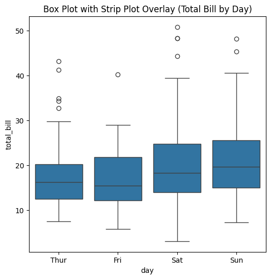
✍️ IX. Code Example
# Single box plot
import seaborn as sns
import matplotlib.pyplot as plt

# Load sample dataset
tips = sns.load_dataset('tips')

# Combined with box plot
fig, ax = plt.subplots(figsize=(6, 6))
sns.boxplot(x='day', y='total_bill', data=tips, ax=ax)
plt.title("Box Plot with Strip Plot Overlay (Total Bill by Day)")
plt.show()
⚡ IX. Pro Tip while plotting
1. Median vs Mean Comparison
Display both median and mean to understand skewness impact:
sns.boxplot(x='category', y='value', data=df, showmeans=True,
		meanprops={"marker":"^",
					"markerfacecolor":"red",
					"markeredgecolor":"red",
					"markersize":8})
If mean > median: Right-skewed distribution (outliers pull mean up)
If mean < median: Left-skewed distribution (outliers pull mean down)
If mean ≈ median: Symmetric distribution
2. Horizontal Box Plots for Many Categories
When comparing many categories with long names, use horizontal orientation:
sns.boxplot(y='category', x='value', data=df, orient='h')
📌 This prevents label overlap and improves readability, especially with 5+ categories.
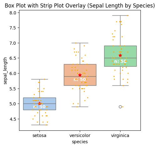
3. Show Number of Observations
Show the number of observations in the boxplot.
# Calculate number of obs per group & median to position labels
medians = df.groupby(['group'])['value'].median().values
nobs = df.groupby("group").size().values
nobs = [str(x) for x in nobs.tolist()]
nobs = ["n: " + i for i in nobs]

# Add it to the plot
pos = range(len(nobs))
for tick,label in zip(pos,ax.get_xticklabels()):
    plt.text(pos[tick], medians[tick] + 0.4, nobs[tick], horizontalalignment='center', size='medium', color='w', weight='semibold')
4. Add Jitter
By adding a stripplot, you can show all observations along with some representation of the underlying distribution.
sns.stripplot(x='species', y='sepal_length', data=df_iris, color="orange", jitter=0.2, size=2.5, ax=ax)
With Jitters, Mean and number of observations added, below is how the Box Plot looks like.
📚 XI. Documentation & External References
Official Documentation: