Bar Plot / Count Plot
I. Purpose
Display counts or aggregated values for categorical variables. Bar and count plots are essential for comparing frequencies, proportions, or summary statistics across groups, and for visualizing class balance in classification problems.
II. Analysis Type
Univariate (count plot: single categorical variable) or Bivariate (bar plot: categorical + numeric, or grouped bar plot)
III. What to Look For
1. Frequency Distribution
- Tallest bars: Most frequent categories (dominant classes)
- Shortest bars: Least frequent categories (rare classes)
- Uniform heights: Balanced distribution across categories
- Check for class imbalance in classification tasks
2. Class Imbalance
- Severe imbalance: One bar dominates (>70-80% of data)
- Moderate imbalance: Noticeable but manageable differences
- Balanced: Bars roughly similar heights
- May need resampling (SMOTE, undersampling) or weighted models
- Critical for classification problems
3. Comparisons Across Categories
- Identify highest/lowest performing groups
- Look for significant differences between bars
- Compare magnitudes to understand relative importance
- Detect patterns in ordered categories
4. Proportions and Percentages
- Relative heights show proportions
- Calculate: category_count / total_count
- Useful for identifying dominant categories (>50%)
- Important for understanding data composition
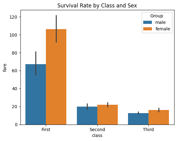
5. Grouped Comparisons (Hue Parameter)
- Use 'hue' parameter for subgroup analysis
- Compare patterns across multiple dimensions
- Look for interaction effects between variables
- Example: Survival rates by gender within each passenger class
6. Ordering and Patterns
- Descending order: Prioritize most important categories
- Ascending order: Highlight growth or progression
- Natural order: Time periods, severity levels (low→high)
- Alphabetical: Default but often not meaningful
7. Missing or Rare Categories
- Very short bars may indicate:
- Data quality issues
- Rare but important events
- Categories to combine or exclude
IV. Interpretation Guide
1. Reading Bar Heights
- Count plots: Height = number of observations in that category
- Bar plots: Height = aggregated value (mean, sum, median, etc.)
- Error bars: Show uncertainty (confidence intervals or standard error)
- Overlapping error bars suggest no significant difference
- Non-overlapping error bars indicate likely significant difference
2. Common Patterns and Their Meanings
| Pattern | Visual Cue | Interpretation | Action |
|---|---|---|---|
| Class imbalance | One bar much taller than others | Severe imbalance in target/classes | Consider resampling or class weights |
| Balanced classes | Bars of similar height | No major imbalance | No action needed |
| Group separation | Bars for different hues well separated | Strong group effect | Investigate group differences |
| Overlapping bars | Bars for different hues overlap | Weak or no group effect | May not be significant |
| Short bars | Very low bars | Rare categories or missing data | Consider combining or removing |
| Zero-height bars | Bar missing for a category | No data for that category | Check data completeness |
| Stacked bars | Bars divided into colored segments | Multiple subgroups within each category | Use for composition analysis |
| Wide error bars | Large uncertainty | High variability in group | Collect more data or use robust stats |
| Narrow error bars | Small uncertainty | Low variability, reliable estimate | Confident in group differences |
3. Visual Cues for Imbalance and Group Differences
- Imbalance: Tallest bar is >3x shortest bar (imbalance ratio >3:1)
- Group effect: Bars for different hues are clearly separated
- No effect: Bars for different hues overlap substantially
4. Spotting Outliers and Rare Categories
- Outliers: Extremely tall or short bars
- Rare categories: Bars with very low counts
5. Statistical Significance
- Error bars in
sns.barplot()show 95% confidence intervals by default:- Non-overlapping bars: Likely statistically significant difference
- Overlapping bars: Difference may not be significant
- Wide error bars: High variability, less confidence in the estimate
- Narrow error bars: Low variability, more confident estimate
V. When to Use Bar/Count Plots
- Comparing frequencies or proportions of categorical variables
- Checking class balance in classification problems
- Visualizing aggregated statistics (mean, sum, median) by category
- Exploring subgroup patterns with hue/grouped bars
- Presenting summary statistics for categorical data
VI. When to Avoid
- When showing distributions of continuous variables (use histogram/KDE instead)
- When there are more than 20 categories (consider grouping or alternative visualizations)
- When precise values are needed (use tables instead)
- When sample size is very small (bars may be misleading)
VII. Disadvantages
- Can hide within-category variation (shows only summary, not distribution)
- Not suitable for continuous variables
- Too many categories make plots unreadable
- Can be misinterpreted as showing distribution shape (use box/histogram for that)
- Error bars may be misunderstood by non-experts
- May not reveal distribution shape or multimodality within categories
- Can be misleading if categories are not mutually exclusive or exhaustive
VIII. Code Example
import seaborn as sns
import matplotlib.pyplot as plt
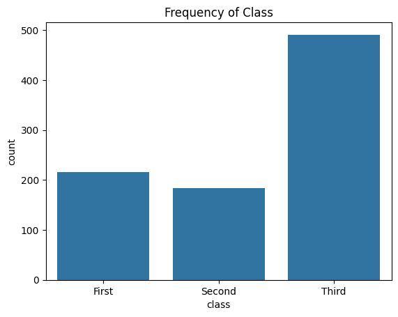
# Load the built-in "titanic" dataset from Seaborn
titanic = sns.load_dataset("titanic")
sns.countplot(x='class', data=titanic)
plt.title("Frequency of Class")
plt.show()
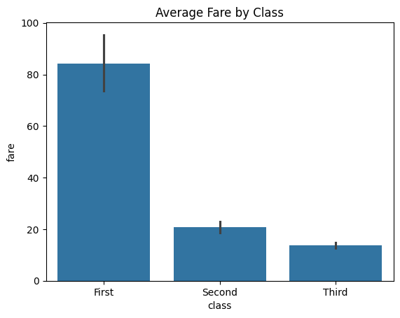
# Bar plot - average value by category
sns.barplot(x='class', y='fare', data=titanic, estimator='mean', errorbar='ci')
plt.title("Average Fare by Class (with 95% CI)")
plt.ylabel("Average Fare ($)")
plt.show()
# Grouped bar plot - comparing across two dimensions
sns.countplot(data=titanic, x='class', hue='survived')
plt.title("Survival Count by Passenger Class")
plt.xlabel("Passenger Class")
plt.ylabel("Count")
plt.legend(title='Survived', labels=['No', 'Yes'])
plt.show()
IX. Common Pitfalls
- Not ordering bars: Use
order=df['col'].value_counts().indexfor descending order - Too many categories: Limit to 10-15 bars; combine rare categories into "Other"
- Ignoring error bars: Always check variability, not just means
- Wrong estimator:
meanvssumvsmedian- choose based on data distribution
X. Pro Tips
1. Add Percentage Labels
For count plots with imbalanced categories, add percentage labels on top of bars:
ax = sns.countplot(x='category', data=df, order=df['category'].value_counts().index)
total = len(df)
for p in ax.patches:
    percentage = f'{100 * p.get_height() / total:.1f}%'
    ax.annotate(percentage,
                (p.get_x() + p.get_width() / 2., p.get_height()),
                ha='center', va='bottom', fontsize=10, fontweight='bold')
plt.title("Category Distribution with Percentages")
plt.xticks(rotation=45)
plt.tight_layout()
plt.show()
2. Horizontal Bars for Long Names
When category names are long, use horizontal bars to improve readability:
sns.countplot(y='category', data=df, order=df['category'].value_counts().index)
The y parameter creates horizontal bars, and labels won't overlap.
3. Custom Aggregation Functions
Use custom estimators for specific calculations:
# Median instead of mean (robust to outliers)
sns.barplot(x='category', y='value', data=df, estimator='median', errorbar=('ci', 95))

# Custom function: 90th percentile
import numpy as np
sns.barplot(x='category', y='value', data=df, estimator=lambda x: np.percentile(x, 90))
When to Use Bar vs Count Plots
Use Count Plot when:
- Counting occurrences of categorical values
- Checking class balance in classification
- Exploring categorical feature distributions
- Only ONE categorical variable
Use Bar Plot when:
- Aggregating a numeric variable by category (mean, sum, median)
- Comparing averages across groups
- TWO variables: one categorical (x), one numeric (y)
- Need error bars to show uncertainty
XI. Documentation & External References
Official Documentation:
Understanding Class Imbalance
Calculate imbalance ratio:
# Check imbalance
class_counts = df['target'].value_counts()
imbalance_ratio = class_counts.max() / class_counts.min()

print(f"Imbalance Ratio: {imbalance_ratio:.2f}:1")
if imbalance_ratio > 3:
    print("⚠️ Significant imbalance detected - consider resampling")
Imbalance Severity:
- 1:1 to 1.5:1 → Balanced (no action needed)
- 1.5:1 to 3:1 → Mild imbalance (weighted loss functions)
- 3:1 to 10:1 → Moderate imbalance (SMOTE, class weights)
- >10:1 → Severe imbalance (combined resampling + weighted models)